
Finding Your Site’s WordPress Version
December 14, 2018Effective lead optimization strategies are the key component of predicting a website’s success. Far too many websites fail to capture their visitor information before they’re gone. Here are 12 of the best conversion techniques that will help you optimize your website for leads. After all, who wouldn’t want to reduce their bounce rate, increase their conversion rate, and watch their ROI continue to improve?
I. Building the Better User Experience
Content is King
Far too many websites fail to consider the whole user experience. Websites that do spend serious time building highly-ranking content that users come to learn from, experience emotions through, or engage with a community; for it’s the content that ultimately drives the visitors to return time and time again. Search engines consider these sites subject area experts, and typically display their content on the first page of search results. So in addition to making intriguing content, it’s important that the search engines considers the content relevant too.
Content indirectly affects the lead optimization process, but is a major element of driving traffic. Without stellar content, products, or services, site owners will struggle to acquire visitors. What good does an improved conversion rate offer when there is no traffic to convert? None! Therefore, it’s worthwhile to reinforce the importance of great content as part of the improved user experience.
UI/UX Testing
Likewise, site owners may have the best content in the world, but if visitors are unable to find the content, the website has likely got a User Interface (UI) flaw or User Experience (UX) issue. Be sure to take some time to observe the user click-through patterns and ensure they’re moving through the site as intended. When finding unexpectedly high exit rates, bounce rates or abandonment at an otherwise standard point take careful consideration, including cross-browser testing, with the interface to see if a recent change has caused an unexpected behavior. Utilizing heat maps and analytics can be vital with pinpointing interface flaws. By eliminating frustrating interface factors, or unnecessary clicks, you can expedite the conversion process and subsequently begin the process of optimizing your website for leads.
While perfecting the User Experience is an ongoing art, often corporate strategies require meeting a new goal and redirecting your attention towards leads – the following Lead Optimization strategies offer the perfect set of resources to retarget your visitors and drive them towards the conversion.
II. Strategic Info Bars
With an effective UI in place, visitors can navigate on their own more efficiently. There’s a variety of cases where site owners might be inclined to drive users to a particular page, promotion, or sign-up that they might never do so otherwise. In that scenario, info bars provide the perfect strategic solution.
What is an Info Bar?
While info bars go by a variety of names – hello bars, top bars, floating bars, info bars – they’re a simple and effective bar mechanic with a primary purpose that’s to catch the attention of the end user by suggesting an action, like subscribe or learn more, allowing users to gain access to beneficial content, discounts or special promotions. Info bars typically redirect users to new content and may offer text fields to capture the user’s contact information. Does it work? We’ve found that info bars can be extremely effective at directing traffic.
How should I use an Info Bar?
Traditionally, the bars are placed at the top of the site and can be set to either travel down the page with the user, or disappear upon scrolling. Occasionally, users will display the bar at the bottom, and more advanced bars will only pop-up when a specific action is taken, i.e. reaching the bottom of the page, or after being on a page for a pre-designated amount of time. Advanced bars will offer better mechanics such as delayed page loads (making the bar more noticeable as the content shifts), count-down timers (encouraging the sale), and analytics that should be paired with A/B testing to perfect your top bar content.
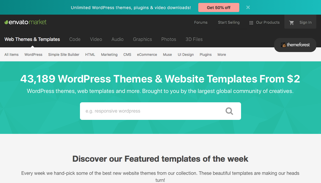
Discounts: Convince the user to convert with a strong offer in your Info Bar. Leverage high contrast buttons for better awareness.

Product Demos: Some use cases are better suited for the bottom of your page, such as the ‘Free Trial’ for a Product Demo.
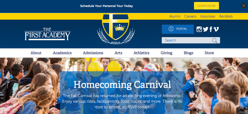
Targeted Offers: Target specific audience members, such as new visitors, to make Info Bar offers more attractive for the clientele.
We tend to see basic top bars convert between 1-2% of the traffic; while more exciting offers may see conversions in the 6-8% range.
What should I avoid with Info Bars?
Marketers should avoid an info bar that doesn’t offer the opportunity to close the bar or decline the offer, as well as any bars that return after they’ve been recently closed or their action was already completed (i.e. doesn’t use a mechanic like a cookie to track the user). Either of those actions will lead to an increase in the page’s exit rate. Typically, when the visitor completes the action, i.e. subscribe, learn more, etc., the bar should disappear semi-permanently.
One downside is that info bars are less effective on mobile devices as they tend to be designed for a wider device and end up taking up a significant amount of mobile onscreen real estate. Additionally, many mobile designs use scrolling navigational elements that further limit the available visual space. If you do decide to use the info bar for mobile devices, be sure to keep an eye on the change in the mobile bounce rate and make sure it hasn’t been impacted negatively since deployment.
III. Modal & Slide-In Pop-ups
When browsing the web, users regularly become deterred by real life distractions or simply find what they need and decide to exit your site: these are excellent scenarios to introduce a modal or slide-in pop-up to try to re-engage or recapture an exiting visitor.
What is a Modal Pop-up?
Technically speaking, a modal pop-up typically is a centered lightbox that appears when a pre-defined trigger occurs, covering the existing content with a dark or light filter, with the intent of convincing the user to take the action shown on the pop-up lightbox. Simply put, a modal pop-up is a box that appears when you do something that the marketer opted for – such as being inactive for a certain amount of time or the browser detecting you’re mouse heading to close the page.
You’ll find your favorite news agencies attempt to capture you, online shops offer discounts if you haven’t purchased, and industry blogs tend to frequent this method because it works!
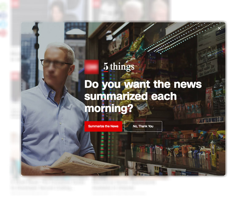
Value Proposition: Offering a value proposition to the customer is a common tactic for news agencies to acquire subscribers.
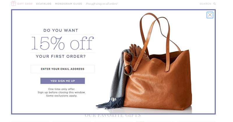
Discounts: Incentivizing newsletter subscriptions is a popular tactics for online boutiques.
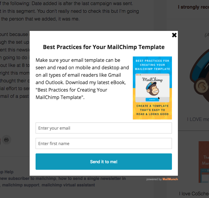
Free Guide: Offer an eBook or PDF in exchange for the user’s email.
What is a Slide-In Pop-up?
Slide-in pop-ups are what they sound like: a smaller pop-up that enters your screen from one side. These are usually small and on the bottom right quadrant of your screen, but large enough to present an engaging offer. They too are designed to appear when a user completes a particular action: often triggered by scrolling past a particular section, staying on-page for some time period, or hitting the bottom of the article.
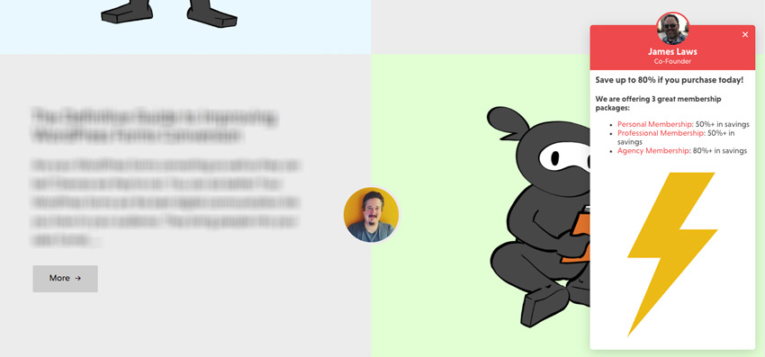
Action Steps: Before the client hits the bottom of your page, use a slide-in to ask your client to take a desired action.
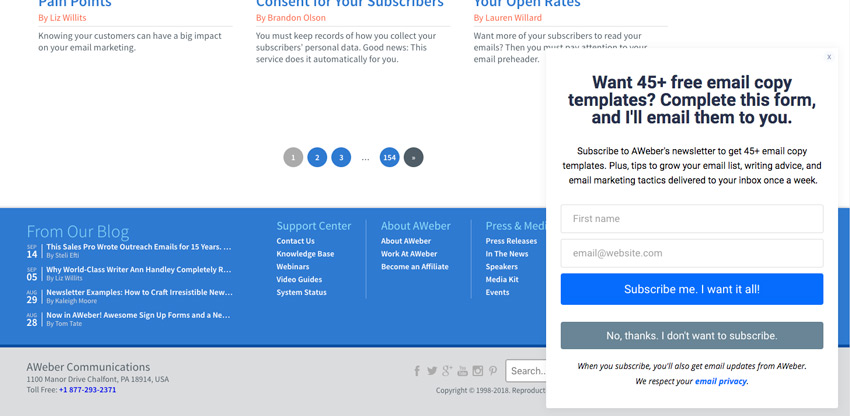
Templates: Users don’t like to give away their email for nothing. Incentivize your newsletter subscription with a relevant offer.
How can Pop-ups be used effectively?
Slide-ins are best presented with supplemental offer content and used for less urgent situations like that of exit-intent. The larger full-screen modal pop-ups do a better job of trying to recapture an exiting visitor as the fullscreen takeover is much more noticeable. Similarly, the annoyance factor of being presented with too many modal pop-ups can quickly cause marketers to lose a lead; it’s wise to limit the number of modal pop-ups for a single session. For frequent pop-up engagements, slide-ins are more acceptable, especially, the slide-ins that have been programmed to time out not requiring the user to ‘x’ them and those appear over less important areas.
When it comes to offers to present, its best to avoid the, “hard no.” Instead of offering users the option of, “No,” try something polite like, “Ask me later.” For sites directly selling products and services it may be more acceptable the push the user into feeling obligated to try your offer: instead of, “Ask me later,” your decline might be, “No thanks, I’d rather not grow email list,” softly shaming the user into the acceptance. Likewise, your acceptance note can be a positive push or monetary incentive like, “Get Started for Free.”
IV. Exit Intent Behavior
Exit intent tracking recaptures potentially lost leads using through last-chance offers. By incorporating exit-intent technology marketers can help their clients decrease exit rates significantly and improve the value of their pages. As the visitor’s mouse heads towards the top of the screen, exit intent technology will present the visitor with a call to action such as an overlay or pop-up. In most cases its cheaper to keep your lead by offering a coupon, than re-pay your cost of acquisition; therefore, it’s important that marketers spend time designing attractive offers – whether that means effective verbiage, or beautiful imagery typically depends on the use case. Effective exit-intent strategies typically sign subscribers at 3-5%, re-engage leads with free eBooks or coupons at a 10% rate, and convert to sales with discounts at roughly 9%.
Another benefit of using exit-intent behavior is that you can reserve your best offers for exiting visitors. There are a handful of visitors that won’t need additional convincing, and therefore are fine to take the initial offer. Similarly your can instantly recover your abandoned carts with immediate offers. Your goal with exit intent behavior is to re-engage the visitor and drive them towards a sale or subscribe. If discounts or incentives aren’t applicable, exit intent behavior at least offers a great way to ensure every visitor sees one new product or offering.
V. Purposeful Call to Action
What is a Call to Action?
Call to actions (CTA) provide action steps for the visitor. In most cases the call to action comes through the form of a button. Effective call to actions will pair captivating design elements with strong verbs. “Go Premium,” or, “Play Free,” and the common actions like, “Get Started,” or “Give,” all clearly tell the user what to expect and what to do next.
How can I use a Call to Action Effectively?
Every call to action should offer attractive design, compelling copy, an understood value proposition, and be paired with a page designed specifically for that call to action.
Attractive design helps the visitors notice and be interested in your call to action. Marketers should pay attention to color and focus on the CTA contrasting surrounding elements to improve visibility.
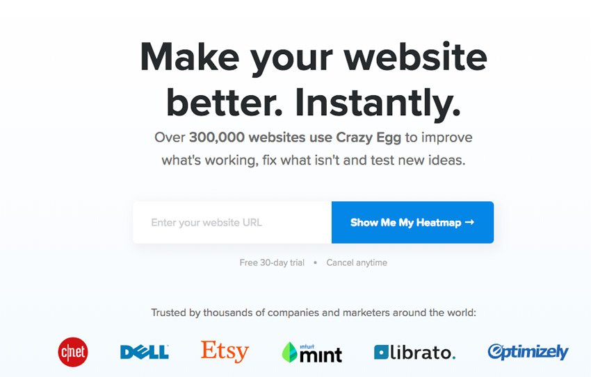
Trust Factors: Combining an impossible to miss call to action, with compelling copy, and trust factors lead to a high conversion rate.
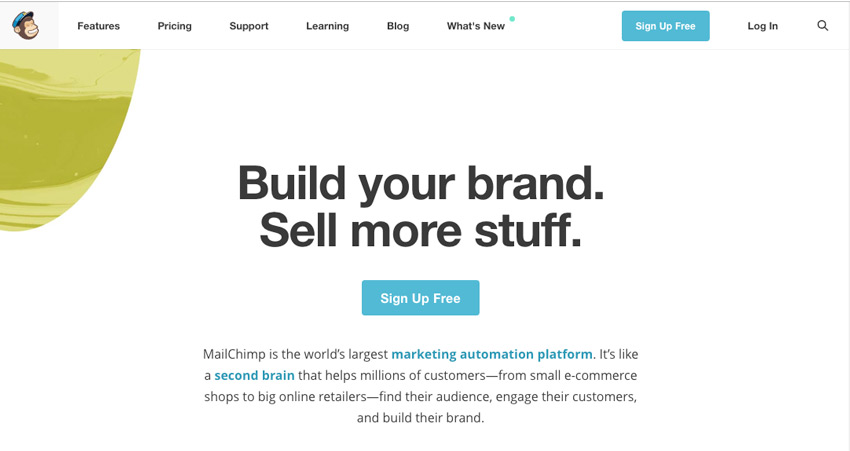
Brand Consistency: Let the message do the talking, and keep your offers consistent. Notice the same offer in the top navigation bar.
When paired with compelling copy clearly stating what they should expect to see, users are more easily persuaded into clicking your button; however, the efficiency of your call to action is only as good its landing page. If all of your call to actions simply drop the user on the ‘Contact Us’ page, you’ll find your lead funnel abandonment far greater than if you’ve designed a specific page for that action. Especially when your call to action is an intake form towards the bottom of your page, your visuals should assist in directing the users towards your CTA.
What should I avoid with a Call to Action?
Too many websites fail to utilize their white space: you’ll see far photographers that display sliders of their photography and fail to provide a call to action or step to be taken for the visitor. Historically, 40% of the audience never scrolls past the fold, or the area displayed onscreen before scrolling. For that reason, it’s highly important that you use your above the fold space effectively and give your visitors an effective call to action. Capture the lead whether its completed sale or an email address.
And while buttons have been proven to be more effective than text based links – if you’re going to utilize a text based link always avoid, “Click here” links. In addition to being accessibly inadequate, boring and dated- “Click Here,” simply fails to tell the user and search engine what to expect.
VI. Multiple Landing Pages
When designing ads and marketing campaigns its often best to avoid landing on your home page, or core pages for that matter. Your contact us, about, and service pages typically aren’t optimized specifically for your acquisition source. To improve conversion rates, its key that Marketers design landing pages specific to their individual marketing campaigns or onsite call to actions.
What is a Landing Page?
Landing pages offer leads conversion-focused alternatives to your core informational pages. While your informational pages may be generic and cover all company bases, landing pages are highly focused and specific to achieving one goal.
For landing pages that are direct from ads, your primary call to action should be highly visible and above the fold; and your headline should match the advertisement. All elements on your landing page should assist in achieving your goals. Testimonials and social proof can provide that trust factor, while videos can improve your conversion rate. Either way you want to showcase your product or service.
VII. Integrate Deeply with Analytics
Knowing your customer and improving the user experience is highly dependent on acquiring customer insights. There are few better ways to know your customer than to integrate with user insight software. Google Analytics is the industry standard for website analytics, providing world class customer insight. And while setting up Google Analytics alone is a great first step – getting hands-on with your analytics is key for every marketer.
Setup Google Analytics
As there’s not fee for Google Analytics, setting up Analytics for every website is a standard practice.
- Using the Google Account you’d like to manage the property with sign in to Google Analytics
- Assuming this is your first time, Click Sign Up
- For ‘What would you like to track?’ use ‘Website’.
- For ‘Website Name’ enter a description of the company or page you intend to track.
- For Industry select a relevant industry – this will align you for benchmarking purposes.
- Select your Time Zone.
- Uncheck or Check Data Sharing Settings.
- Click Get Tracking ID
- Accept the Data Processing Terms
You should be presented your Tracking ID and code you can enter for manual entry. Now you’ll want to add your newly created Google Analytics property’s Tracking ID to your website. Your Tracking ID is UA followed by a dash, nine digits, a dash and the number of the property: something like, UA-123456789-1.
While a variety of themes offer an area to input your Tracking ID, we suggest making use of an Search Engine Optimization integration like Yoast SEO or All in One SEO (AIOSEO) which allow you to add your tracking ID within either. For your clients who likely won’t visit their Google Analytics frequently, consider adding a dashboard display like Google Analytics Dashboard for Word Press (GADWP).
With Google Analytics in hand, you can focus on troubling bounce rates and high exit pages, drive traffic to content that converts heavily and develop smarter audience profiles.
Connect Ads
Many companies acquire their leads via Google Ads, formerly Adwords, while simultaneously failing to utilize their most valuable insights from Google Analytics. First things first, connect your Google Ads account with your Adwords:
- Login to Google Analytics
- Navigate to the property you’d like to connect to Adwords.
- Select Admin (Gear) in the bottom left
- In the second column, select Google Ads Linking.
- Click + New Link Group and select the Google Ads account to link
- Turn Linking to On
- Select Link Accounts
This will allow you to integrate goals from Google Analytics, obtain an accurate ROI for your Ads ROI, and acquire further insights on paid leads.
Tracking Conversions
Whatever the success indicator of the site, be it file downloads, form submits, page visits, email signups, etc., marketers can setup Google Analytics Goals to indicate a visitor has completed the goal task, also known as a conversion. By tracking conversions, and assigning monetary values (or worth) to otherwise non-monetary transactions, users can ascertain an ROI where otherwise not applicable. Do 10% of your visitors subscribe and 10% of subscribers historically convert? What if you can improve your conversion rate by 5% or drive 30% more visitors to the page, how many more customers would you yield? Conversion tracking can provide marketers powerful data to report on and A/B test by.
VIII. A/B Test Everything
Too many users build their campaigns, ads, webpages and call to actions with the first details that come to mind. By analyzing multiple variations over time, marketers can ensure their campaigns convert with the highest efficiency. Furthermore conversion funnels can be analyzed to locate problematic areas, such as high bounce rates in the conversion funnel, and tests can be utilized to improve the workflow.
What is A/B Testing?
A/B Testing is a visitor research method where multiple variations of the same content are used to test one or more change for the optimal variation. A/B testing can be used to compare and analyze differences in headlines, text content, testimonials and social proof, call to action text and design, links, images, and anything that affects your visitors engagement.
How can I be effective with my A/B Testing?
To be most effective, marketers should run their A/B testing using a scientific approach:
- Review site analytics for pages with conversion detractors: problems like high bounce rates or exit pages are a solid starting place.
- Observe the users and define the issue: when possible, observe the user behavior with technologies like heat maps or on-page surveys assisting in defining an issue, “the visibility of the call to action is lacking.”
- Set your hypothesis with the goal of improving conversions: “changing the button to a contrasting color will provide the visibility required to increase conversion.”
- Test your hypothesis: setup your new variation and begin a test against the original. The test should track conversion rates over a predetermined amount of time.
- Analyze the results and take action: review the results to see which variant achieved the highest conversion rate. If the test is inconclusive its time to redo the hypothesis. If the data shows a significant difference in the variations move forward with the successful variant. Be sure to share the data with any other relevant departments.
Google recently discussed its suggestions for A/B testing and encouraged the following: no cloaking – the same content is shown to the Google Bot as is shown to humans and using 302s for content redirects instead of 301s as tests are intended to be temporary. While testing for the optimal call to action text is great, advanced strategies include A/B testing promotional offers, lengths of free trials, and UI adjustments.
Furthermore, to ensure accuracy, rather than testing multiple changes, such as color and text changes in the same A/B test, best practices suggest performing A/B individually for each change.
Its important to consider all aspects of the conversion funnel; not only do high bounce rates and exit pages require attention, but other areas, such as your exit-intent solutions, can assist you in realizing your most compelling content: as your visitor had already decided to leave and has found your offer more engaging than your previous content. Thus, focusing your A/B testing on reducing your exit rate, you can quickly learn what content your users find valuable.
IX. In-Content Forms
Along with converting sales, acquiring lead information is the primary goal of a marketer’s website; thus, building an attractive, quick and easy to use form should be a priority. WordPress offers a myriad of solutions capable of delivering a form, but many have proven they handle the task more effectively than others: simple forms are best handled by Contact Form 7, whereas complex forms are better suited with advanced form builders like Gravity Forms and Ninja Forms. All three of these solutions provide top notch automated integrations – such as passing your leads directly into your CMS like Salesforce or Email Marketing Solution like Mailchimp.
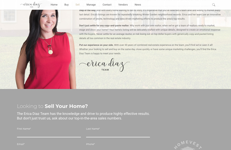
Form Design: Beautiful forms provide a layer of trust that your average contact form fails to provide
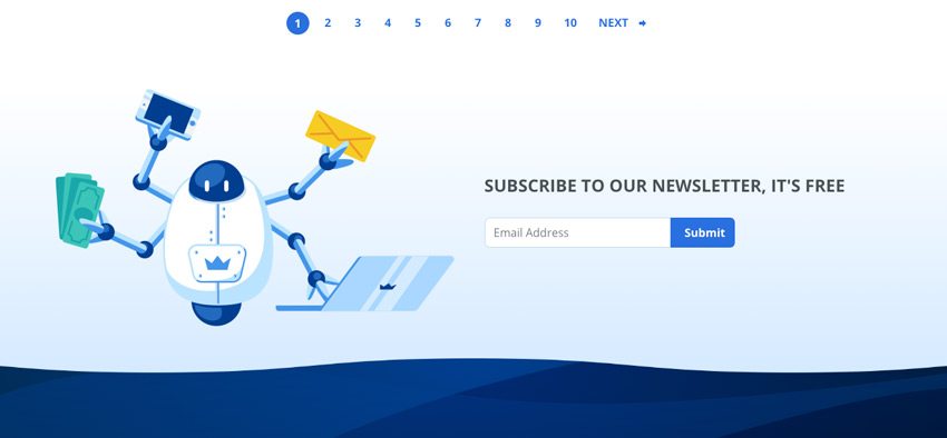
Visuals Matter: Visuals and humor are effective alternatives to a value proposition. Clever designs can get their point across without offering a discount or ebook.
X. Implement Caching
Both a major factor in search engine optimization and reducing bounce rates with visitors is your website’s load time, or site speed. Websites lacking caching systems are perpetually playing catchup when it comes to site speed, as every page you load requires visitors to reload the resources.
What is a WordPress Caching System?
A WordPress caching system is a plugin or integration dedicated to improving site performance. Typically, caching systems utilize a handful of technologies from compression techniques to preloading, as well as client and server-side caching – which retains content on the system to refrain from downloading again.
Why should I implement Caching?
Caching systems offer a variety of resource aimed at reducing site load time, with a secondary goal of improving search engine rankings. Reduced load times have a direct affect on decreasing bounce rates and indirectly improve conversion rates by retaining more visitors and offering more chances to convert. Most caching systems are quite easy to install, and can be used without a heavy configuration. Although users dedicated to improving their website can spend serious time familiarizing and testing features on their caching system, but in most cases the suggested settings are preferable – these typically include GZIP compression, Browser Caching, Page Caching and Cache Preloading.
XI. Solid Trust Factor
Converting the leads, and building brand loyalty requires a reliable and visible trust factor. Subject area experts, celebrities, users and friends provide the foundations for a trustworthy relationship. Each offering a variety of trust elements useful for your brand’s image.
Testimonials
Testimonials are brand approved messages from previous customers advocating for the product or service provided by the brand. You’ll never see negative testimonials posted across the website, because in most cases they’re hand-picked and align with the content or services displayed on that page. For this reason, testimonials aren’t as reliable as reviews.

Efficient: Testimonials tell your story at a glance, show what value your brand provides and can be efficiently weaved in throughout your content to continue to influence the viewers.
Case Studies
Telling a brands success story can be inspiring to your consumers. Potential customers love to learn from case studies and existing brands love to share their stories of success. Seeing a handful of success stories can be extremely compelling to customers, so be share to include your call to action around and within the stories.
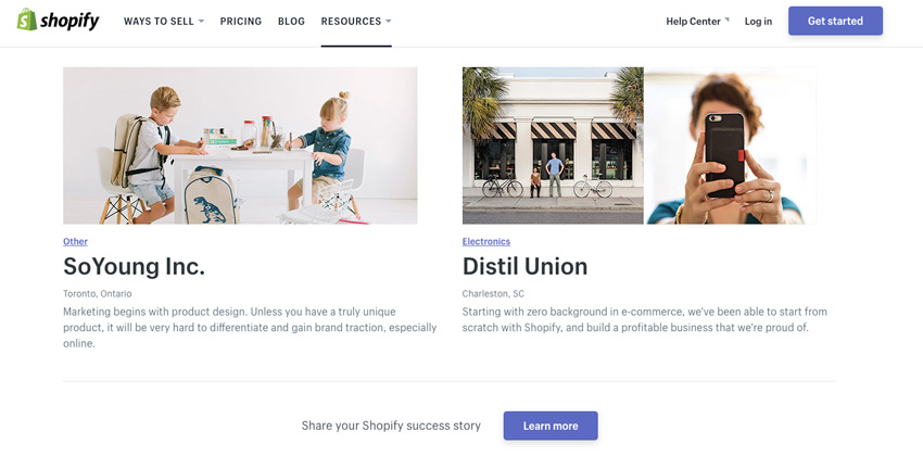
Success Story: Case Studies provide users the chance to learn what value your brought to other companies often in the clients own field.
Client Logos
Showing the brand logos of clients marketers have worked with can establish an immediate connection with your consumers, especially if they’ve already built rapport with your existing clients.
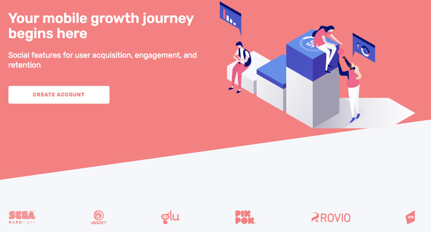
Design Friendly: Using monochrome logos still brings attention to the well known brands, but don’t detract from design features.
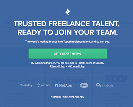
Subtlety Is Key: When you name throw the big names, sometimes its best to do it subtly.
Reviews
Product reviews offer direct consumer feedback, and provide users the chance to preview the experience before buying. Is the product really as good as the picture? How is the quality of the material? Will the customer service experience disappoint? These are typical questions that user reviews often address – and when these reviews are shown on third party websites, the trust factor increases, especially since your brand has little to no ability to influence what is said about the brand. Users can be reassured that your brand is reputable, and the products or services are top notch.
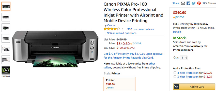
Product Reviews can make or break the sale. Buyers are more likely to trust 900 4-star reviews than two 5-star reviews.
Likes, Subscribers, & Follower Counts
Social media allows users to both connect with your brand personally and see the innate trust built by the brands following. The downside to subscriber count is that followers or likes can often be bought by the brand. The upside is apparent, when large numbers or crowds of people follow your brand – it’s clear you’re doing something right. While its still highly regarded for social media pages, showing social counts has become less popular for webpages. While no longer a direct benefit, social following is still an important indirect factor as social media’s become a strong source of acquisition for many brands.

Trust in Numbers: When visitors see tens of thousands, or in this case millions of followers, reputation is no longer a consideration.
Social Sharing
Friends are select users who people have independently chosen to build a relationship with. Who better to share your brand message than a user’s friend? Social sharing provides an opportunity to engage with users you might not otherwise reach, and through an innately trusted resource – a friend! Leveraging social sharing can be a lucrative opportunity for your brand.
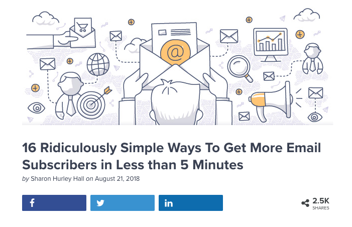
Free Ads: Everytime a consumer shares your content, it’s like running a free ad with a new audience.
Influencers
Expert endorsements and celebrity influencers offer psychological proof sure to build trust. Subject area experts beat out the highest quality reviews by adding years of trust and experience of a popular voice known in the field. Celebrity influencers provide high visibility to your brand and offer an aspirational mindset. While influencers will typically cost you based on their follower size, sometimes a thank you gift to the right person can make for a lucrative share.

Numbers Matter: Being reposted by a brand with a large reach can mean the difference between barely meeting quota and killing it.
XII. Audience Targeting
Audience targeting allows marketers to influence who sees their ads. And by reaching the right audience in the first place, you vastly improve your chance of converting your leads into repeat customers. Using a combination approach of targeting by interests, behaviors, demographics and location have proven highly effective. If you’re selling new team specific football merchandise, you wouldn’t want to throw away dollars with un-targeted impressions or clicks; instead leverage audience targeting to bring appropriate leads – target your highest converting users, for example a male, over 18, with shown interest in fantasy football, NCAA or pro football, located in the US, etc. The more niche your product, the more niche you go with your targeting.
Remarketing
Retargeting or re-marketing is the ability to send ads or messages to users who’ve recently visited your website within a specified amount of time. Ads can follow the users to various partner websites allowing you ample time to influence their opinion or remind them to make that purchase. They’ve already shown interest in your brand – so it makes sense to see if they’ll come back and complete the conversion.

Free Lead Optimization Checklist
Don’t miss a step with our lead optimization checklist, covering the tools and techniques required to make your lead growth shine.

2 Comments
[…] While SEO helps you acquire the visitors, you’ll find it equally important to optimize your site to close more leads. […]
[…] at a much higher rate, roughly 6-8%. While these numbers alone may not seem like a ton, combining all of our lead conversion steps together leads to much more effective conversion […]